Tag Archives: Adobe Photoshop

Best photos of 2013: let sleeping dogs lie

Those of you who follow my blog will know that when I went to Tuscany earlier this year, there were a couple of dogs living on the farmstead that was my home for a week. They were gorgeous animals. I was amazed all week by the ability Elvis had of sleeping without laying his head on the ground. I have one of him asleep standing up but I’ve picked this one instead – he reminds me of a dog carved at the foot of a medieval knight in chain mail on a stone sarcophagus.

Let sleeping dogs lie

As you can see, I edited in Photoshop to give the picture a slightly faded, gentle sepia tint. If I had real patience, I would edit out the harness but I don’t, so I won’t!

Oh, darn it, I shouldn’t have put the thought in my head…ten minutes later, spot the difference.

Elvis without harness and flagstone cleaned.

By Carole Scott

Further experiments in Photoshop Elements

I’m off sick today with a stinking cold and having been asleep for much of the afternoon, I wanted to do something to wake me up. A Photoshop self-tutorial was the fantastic answer.

I picked up April’s edition of Digital Photo, which Dad leant me yesterday as it has some great tips for editing RAW files. Something I had never been able to get to grips with before was ‘layer masks’. I just didn’t understand their purpose.

Digital Photo had one answer (I’m sure there are many). They are perfect for pictures that are spoilt by a huge difference between highlights and shadows, a common problem shooting on bright, sunny days with trees, for example. Unfortunately, Dad had chucked out the DVD that comes with the mag, that includes the example images they use in the tutorials but I have a few images with this problem, so I followed the instructions.

The idea is to create a separate image for each section in the picture and then blend them, taking the best bits from each one. The example used in Digital Photo had three areas, mine just two.

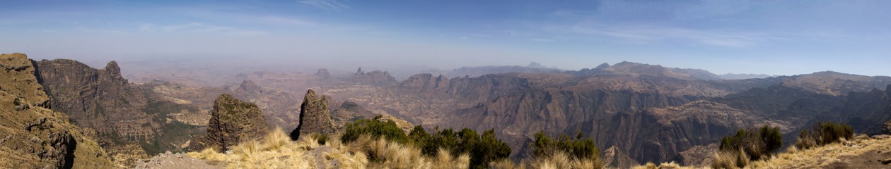
Here is the original image – not the most inspiring photo but a good example of bright sky and gloomy foreground.

BeforeHere’s what happens if I simply try to use some fill light to bring the foreground out of the shadows – the sky and the house become far to bright and harsh. The foreground has some detail but is still pretty gloomy:

Trying to correct without using layers

So, to correct it more effectively, I had to create two images. The first sorts out the foreground but as you can see, it has a hideous effect on the house.

Sorting out the foreground

The second gets the temperature right for the house but still has the foreground in near total darkness.

Warming up the house

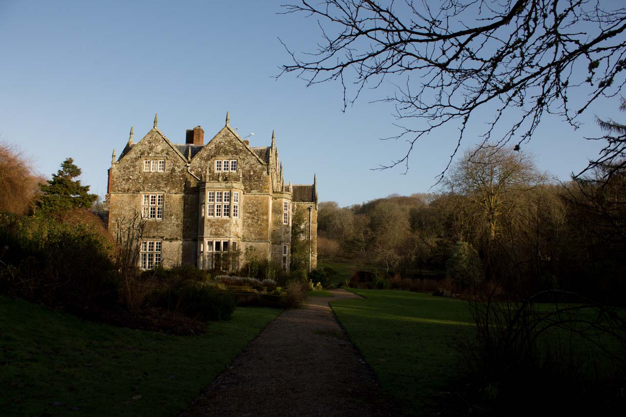
The key is to take both of these and blend them together – showing the foreground of the first one and the house/sky of the second.

The Digital Photo feature with fantastic instructions is on page 70.  I was a bit nervous as I really didn’t understand it but as soon as I worked on the second layer I did. It’s one of those techniques I had to see at work to understand. And the wonderful thing about digital images is, of course, that you can dump any mistakes!

Here’s the final image:

Final result

As I said, it’s not the most inspiring photo but it was a great one on which to see the difference this technique makes.

By Carole Scott


Photoshop editing: learning all the time

I went to my Dad’s for lunch yesterday. He’s a fantastic amateur photographer and is in a camera club. This means that he has real motivation to get his editing ‘just so’.

I have been struggling with exposure recently – selective areas of photos taken in bright light being too bright, leaving shadowy areas with virtually no detail. I had started to use the ‘fill light’ slider in the RAW editor but Dad helped me even further with a quick tutorial in using the RAW editor a bit more thoroughly and then in Photoshop using the dodge and burn tools.

Here are some results. Dad rightly pointed out that many of my Inle Lake photos from Burma featured the fishermen in silhouette. While this can add drama, in these particular photos, that wasn’t necessarily the case here. Here’s the difference I’ve just made by using the ‘fill light’ (highlights) slider as well as the recovery slider to achieve detail in the background hills. I upped the contrast and also used the clarity slider gently.

Before:

Before - nice silhouette but lacking in detail throughout. © Carole Scott 2013
Before – nice silhouette but lacking in detail throughout.
© Carole Scott 2013

After:

After: more colour/detail in the fisherman and in the background hills?

Using the dodge and burn tools, I managed to get rid of some of the distracting overblown exposure in these photos. In the first one, it’s the yellow urn that was way too bright. I used the magnetic lassoo to grab the area of the urn I wanted to work on and then used the burn tool to take some of the brightness off. The upshot is that the leaf curling down is now also in contrast and more visible. It’s a tiny bit of work but it makes a big difference to the viewing experience.

Before:

© Carole Scott 2013
© Carole Scott 2013

After:

© Carole Scott 2013
© Carole Scott 2013

I’m still learning, so the results will be patchy for a while, I’m sure. Any other tips gratefully received!

By Carole Scott

P.s. Here’s another great edit I’ve done since writing this post – cooled the temperature a tiny bit (from a tip in the April edition of Digital Photo), and reduced the blare on the white t-shirt by using recovery and the burn tool

Before:

© Carole Scott 2013
© Carole Scott 2013

After:

© Carole Scott 2013
© Carole Scott 2013